Embellishment and Branding :
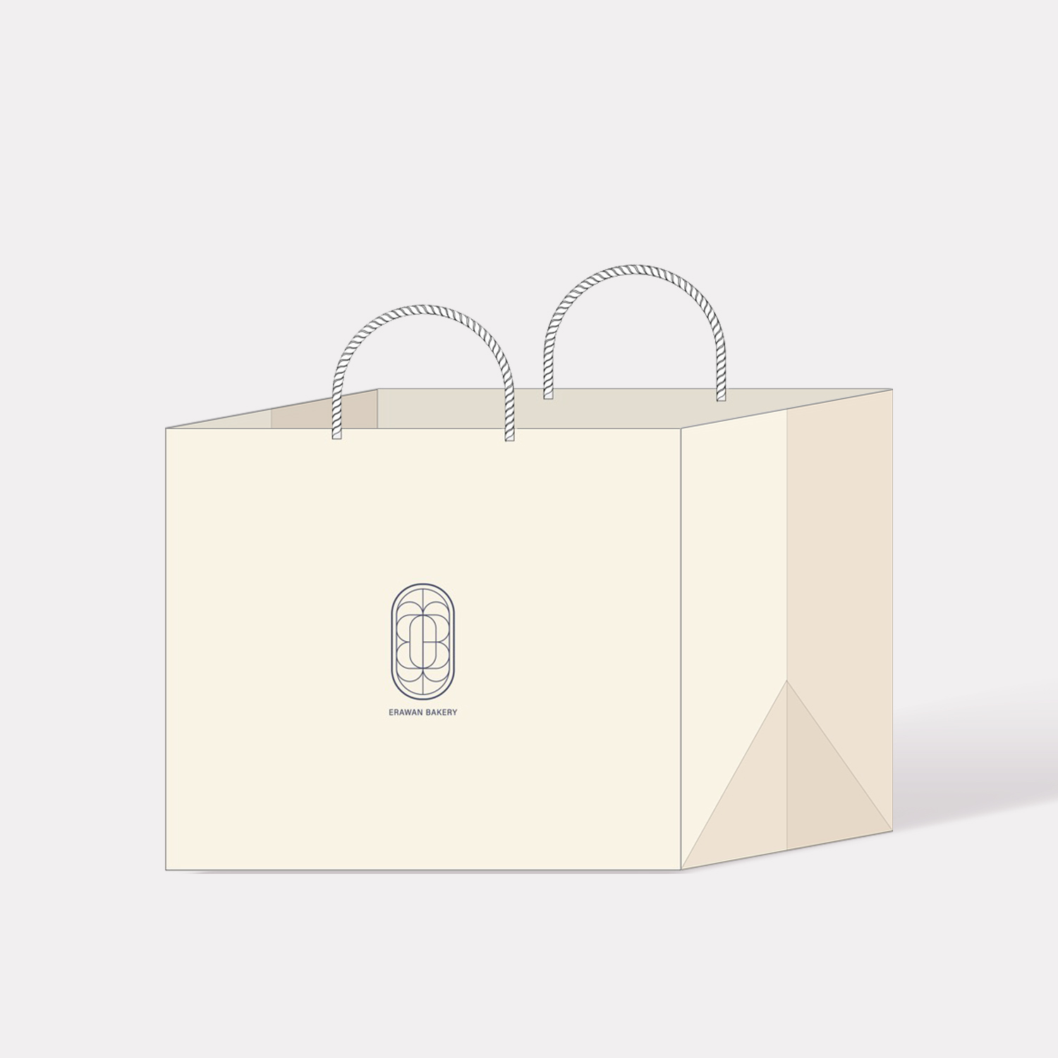
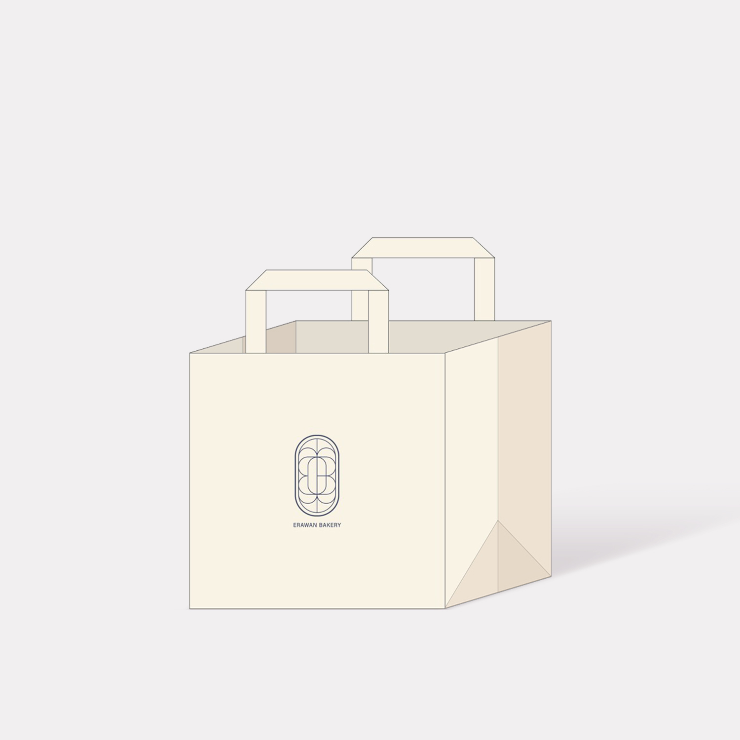
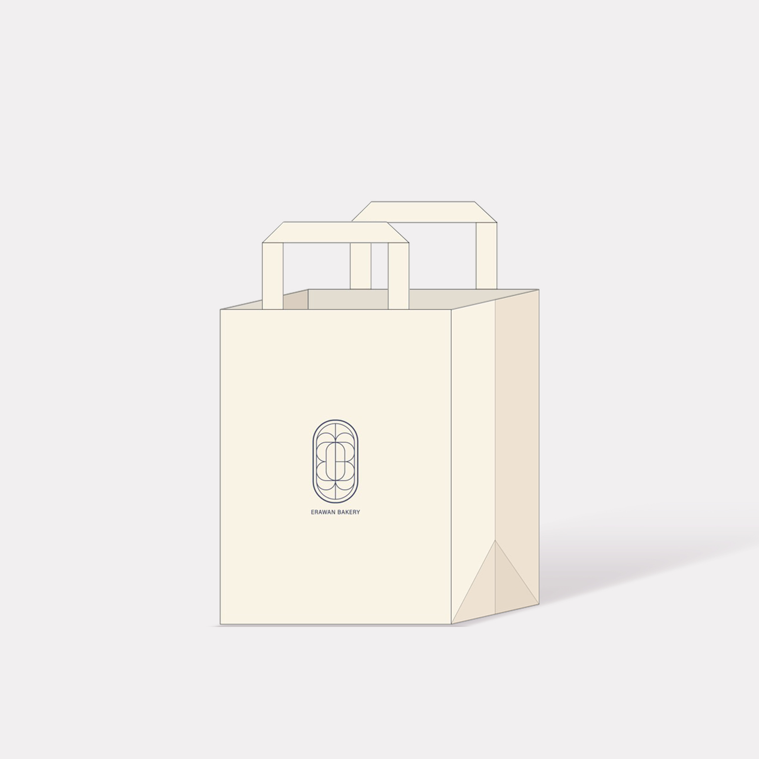
The branding of Erawan Bakery is defined by a sophisticated and versatile visual identity that adapts across different packaging formats.
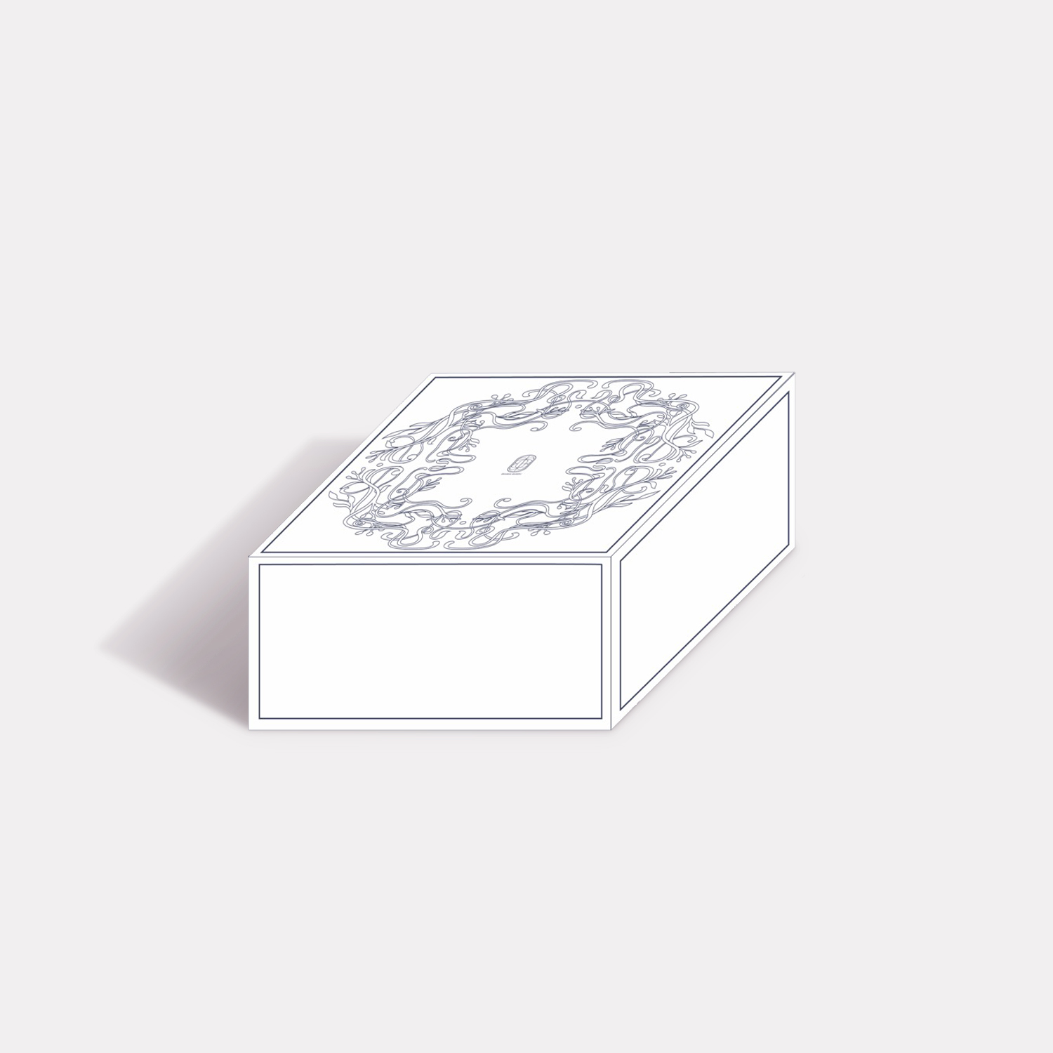
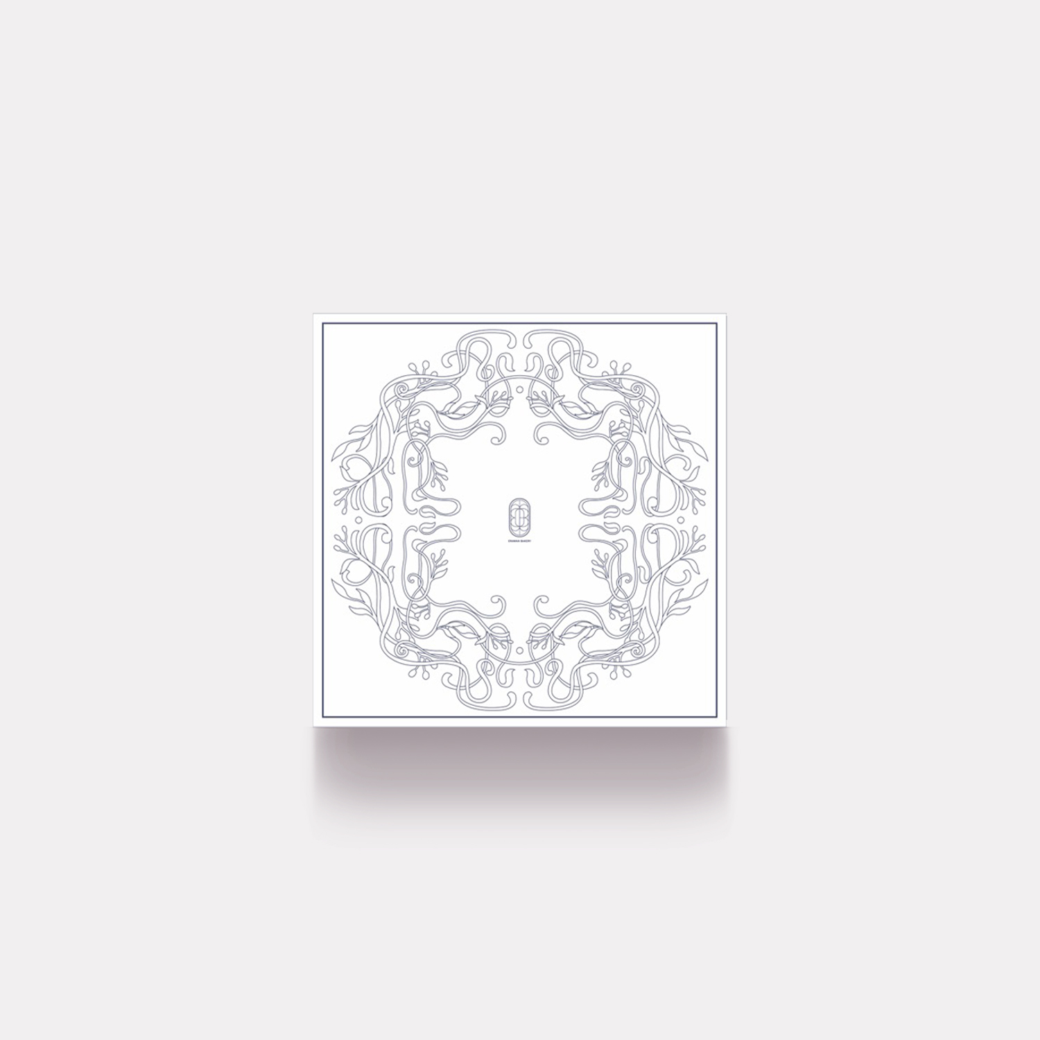
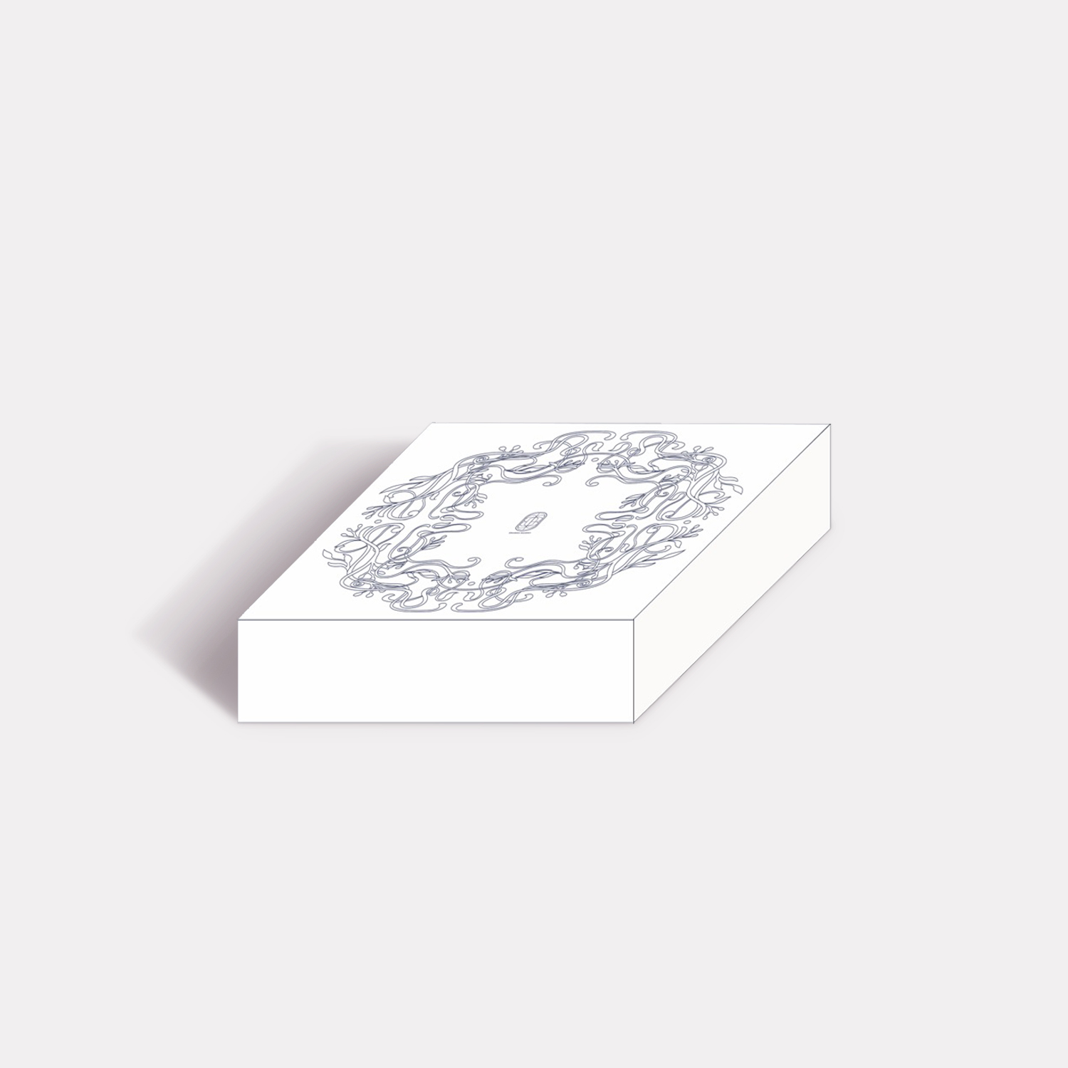
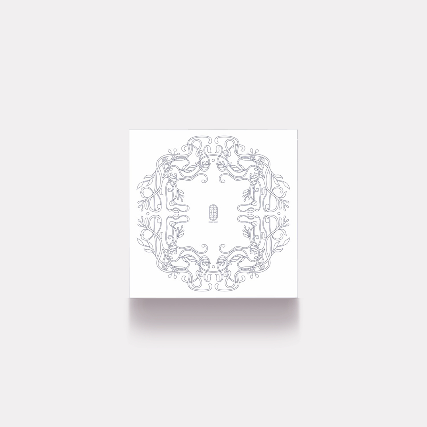
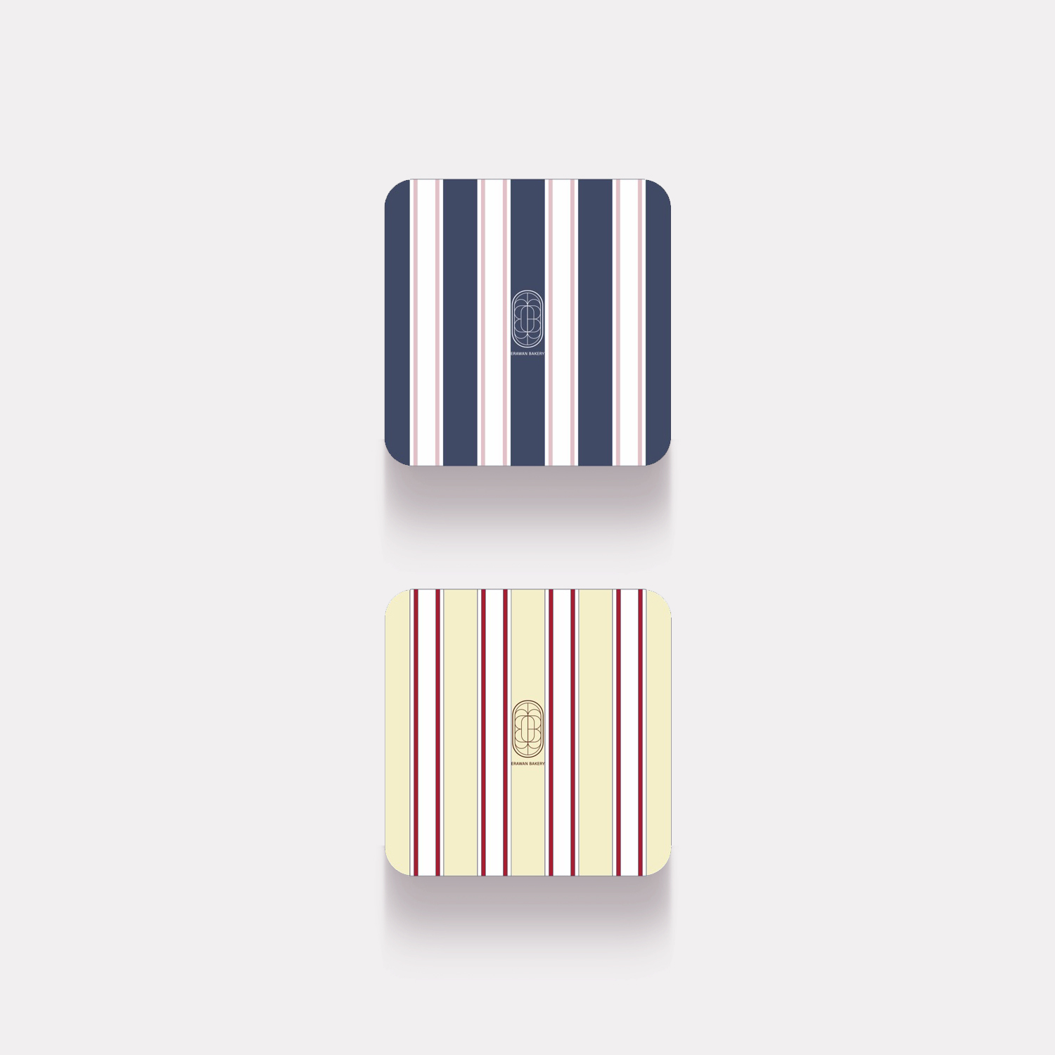
Logotype and Iconography: The primary brand mark consists of a stylized, elongated oval emblem featuring a symmetrical geometric pattern that evokes a sense of traditional Thai heritage blended with modern Art Deco influences. The typography is a clean, minimalist sans-serif that balances the intricate detail of the icon.
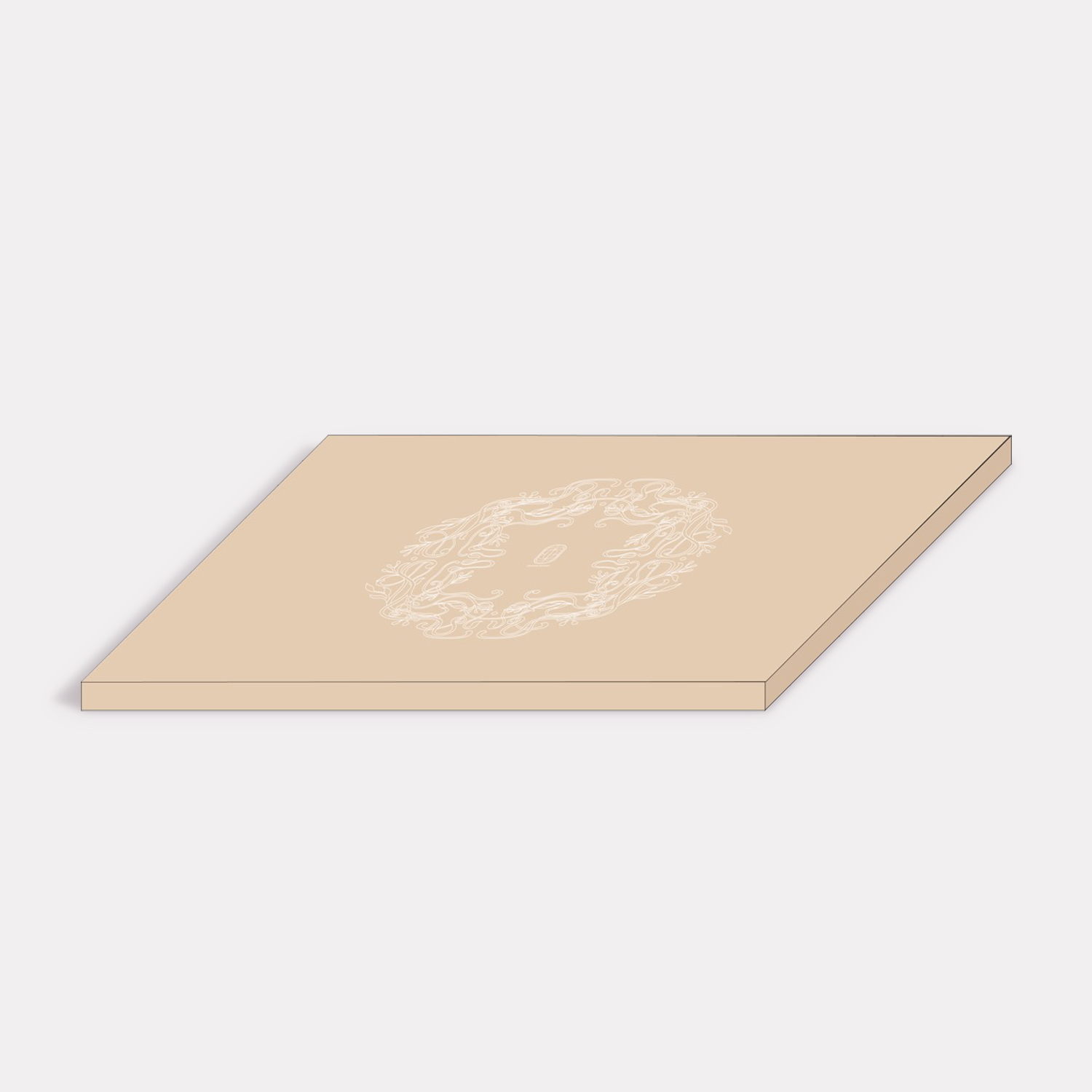
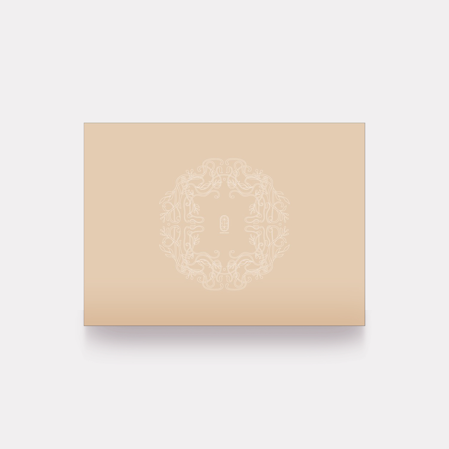
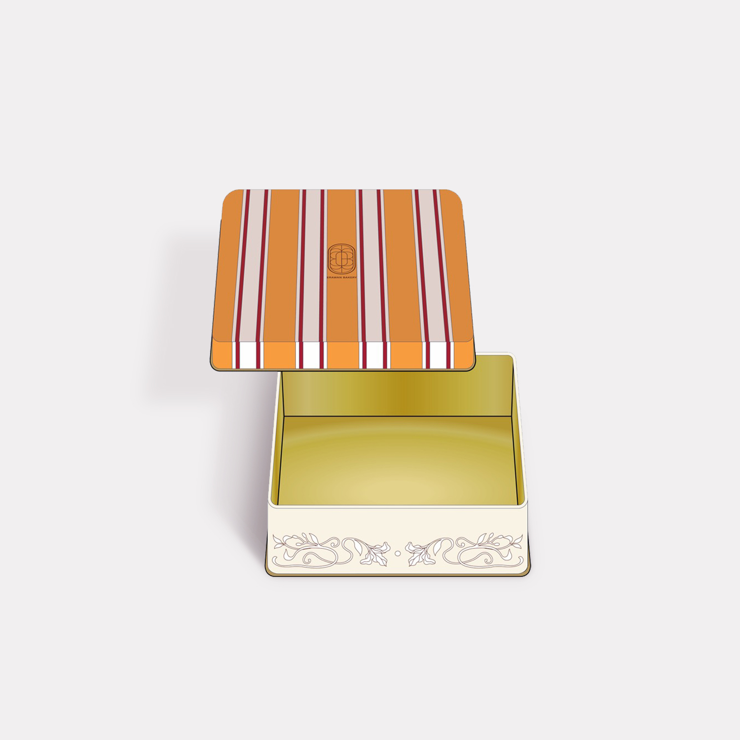
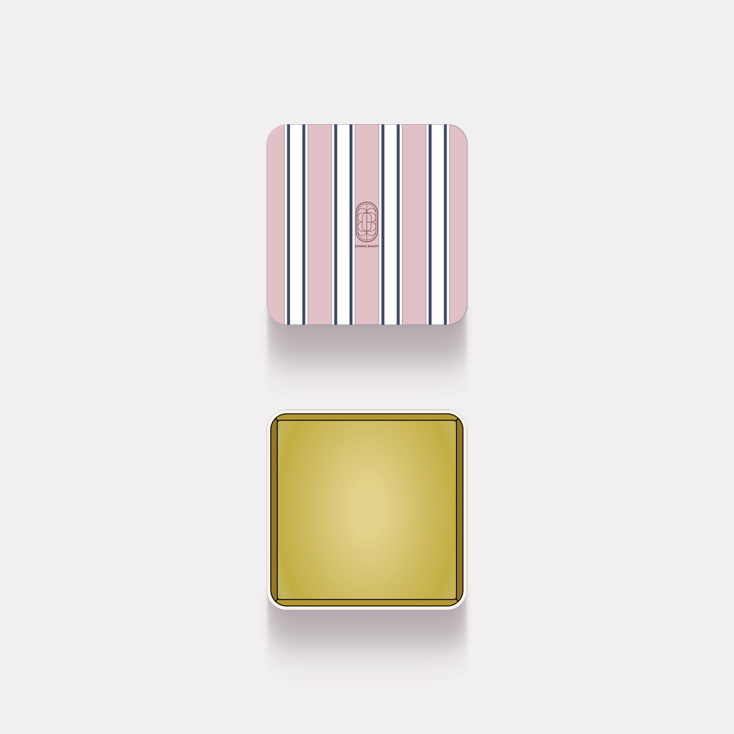
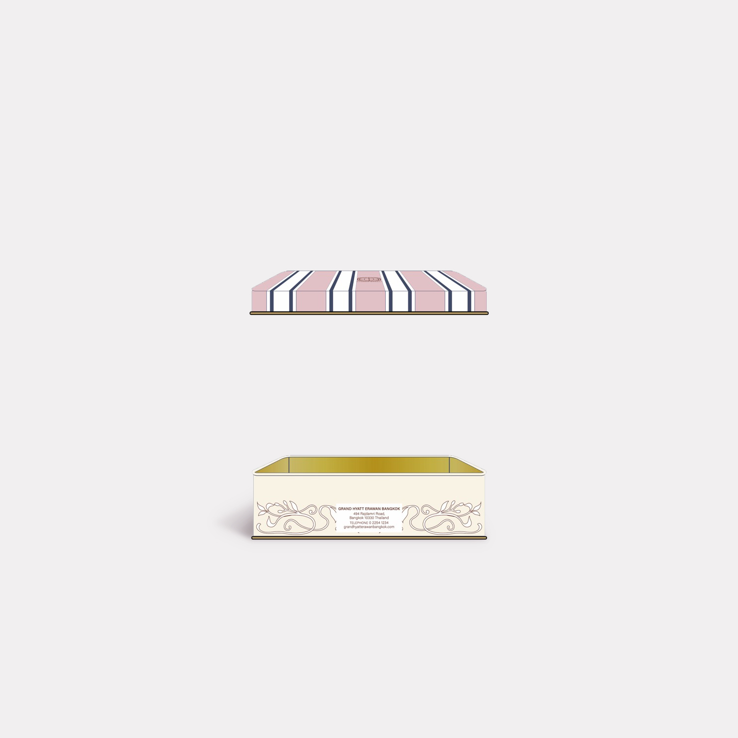
Color Palette: The branding utilizes a "tonal" approach. It ranges from a classic navy blue and cream combination for the primary bags and boxes to a more playful dusty pink, white, and gold palette for specialized tins. The use of gold-lined interiors in the "Single Box" adds a premium, high-end feel.
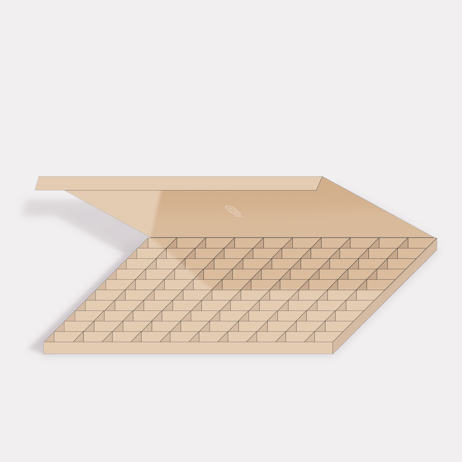
Graphic Details: * Ornate Illustrations: Several pieces (like the Croissant and Praline boxes) feature delicate, flowing botanical or "vine-like" line work that creates a wreath-making effect.
Patterns: The use of bold, vertical stripes on the "Single Box" provides a rhythmic contrast to the more organic illustrations found on other pieces.
Material Finish: The packaging suggests a variety of textures, including matte-finished Kraft paper for a natural, artisanal look and metallic, embossed tin for gift-ready longevity.
Design Concept :
The design concept for Erawan Bakery revolves around the theme of "Contemporary Heritage Luxury." It aims to position the bakery as a premium, artisanal destination through three core pillars:
1. Minimalist Elegance
The use of ample white space and clean lines (specifically seen in the Cake Pound and Croissant boxes) suggests a brand that is confident in its product. The packaging doesn't feel cluttered, allowing the intricate logo to serve as a seal of quality.
2. Modernized Tradition
The intricate linework and the "Erawan" name (often associated with the sacred multi-headed elephant in Thai culture) pay homage to traditional roots. However, the execution—using thin weights and geometric symmetry—pulls the brand into a modern, global aesthetic.
3. Functional Variety
The system is designed for a diverse product range, with specific forms for different needs:
The Kraft Praline Box: Uses a grid-insert system for organization and protection, emphasizing the delicate nature of chocolates.
The Tote-style Bag: Features sturdy rope handles, suggesting a "gift-carry" experience rather than just simple transport.
The Decorative Tin: Designed for "after-use" or collectability, extending the brand’s presence in the customer’s home.